
The nice sample headline fits. Now try a real one, an absent image, and a phone that is narrower than the design file.
A three-word headline is very cooperative. It sits on one line, leaves room for the image, and makes the card look finished. A real title is less considerate.
This is one reason I like working across design and code. The browser makes me deal with the content I hoped would fit.
Change the sample before changing the spacing
For a card, I want to try three things early.
- A short title
- A title that wraps to four lines
- No image
Then I want several of those cards next to each other.
What I check on the card
- Does the whole card grow?
- Is the bottom link still easy to find?
- Does the missing image leave a blank box that looks broken?
If the answer is to tell the writer to use fewer words, I want to know whether that limit actually helps the reader or just protects my layout.
When a limit is fair
Sometimes a character limit is fair. A button label shouldn't become a paragraph.
A useful article title shouldn't need to be rewritten because I only designed one comfortable example.
The phone gets a vote
A desktop row does not automatically become a good mobile page when it turns into a column.
- The image may become enormous
- Tags may take more space than the summary
- Two buttons that fit nicely together can turn into a cramped pair
Look at the actual page
I want to look at the actual page, not just drag the design frame narrower.
- Read the title
- Scroll past the image
- Try the link with one hand
The awkward part is usually obvious once it is in front of me.
My take
I still want the mockup to look good.
Final thought
I just want the finished layout to survive a writer who wasn't looking at the mockup.
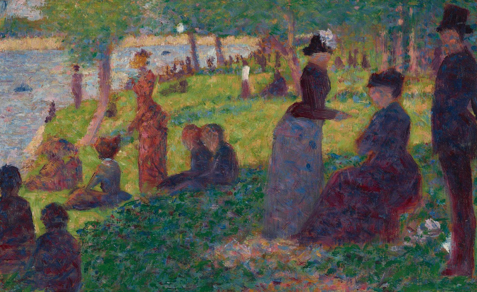
Cover painting: Oil Sketch for A Sunday on La Grande Jatte, Georges Seurat, 1884. Art Institute of Chicago, public domain.
Keep exploring
I still want to know if Save worked
I like a clean screen. I like keeping the paragraph I just wrote even more. A few things I would keep before removing another label.
Read article ↗
I should not need the codebase to fix a paragraph
I want to change a title or replace an image without guessing which field controls it. A few things I look for in a content editor.
Read article ↗