
I like a clean screen. I like keeping the paragraph I just wrote even more. A few things I would keep before removing another label.
I like minimal interfaces. I don't like having to guess whether a button did anything.
Take a simple contact form. I write a message, press Send, and the button changes color. Is that confirmation? Is it still sending? Should I press it again? The page can look excellent and still leave me asking a very ordinary question.
That is the part of minimalism I care about: what I have to figure out after the decoration is gone.
Some words earn their space
A short status line does a lot of work.
- “Message sent” is useful
- So is “Couldn't send. Your message is still here.”
- Neither sentence needs an animation or a clever tone
I just need to know what happened and what I can do next.
Icons can turn into a guessing game
The same goes for icons.
- A bin is familiar
- Three unfamiliar shapes beside an important action are not
I would keep a small label if it saves someone a wrong click.
Test it with an interruption
The version I want to see is the one where something goes wrong halfway through.
- A required field is empty
- The connection drops
- I go back because I remembered a detail
Then I ask three things.
- Does the form keep what I wrote?
- Does the error point to the right field?
- Can I fix that one thing without starting again?
I find those questions more useful than another round of shaving pixels off the spacing. They give me a reason to change the screen.
The trade-off
There is a cost.
- Labels and status messages take space
- A page can become noisy if everything is explained at once
My take
I would show the explanation where the decision happens and leave the rest alone.
Final thought
A clean screen should still answer a simple question: did that work?
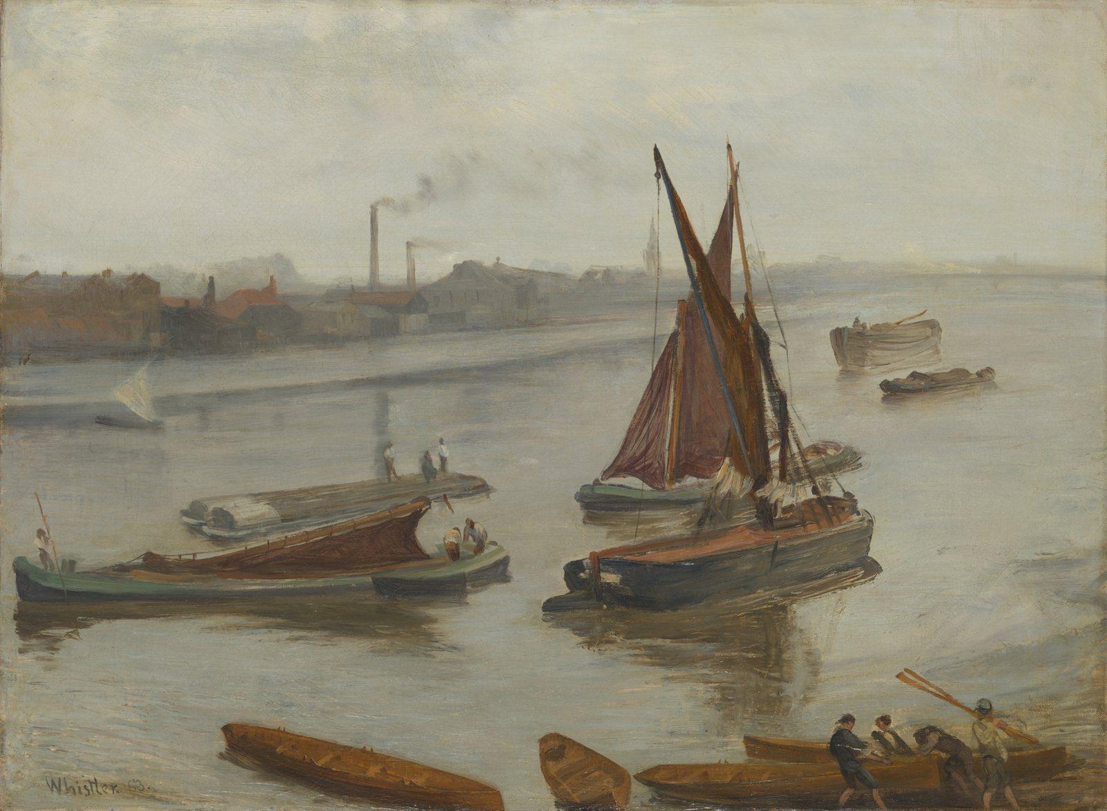
Cover painting: Grey and Silver: Old Battersea Reach, James McNeill Whistler, 1863. Art Institute of Chicago, public domain.
Keep exploring
Put the long title in the mockup
The nice sample headline fits. Now try a real one, an absent image, and a phone that is narrower than the design file.
Read article ↗
I should not need the codebase to fix a paragraph
I want to change a title or replace an image without guessing which field controls it. A few things I look for in a content editor.
Read article ↗