Figma
Design File
The Lucent design file.
Open artifact ↗
Loading your next stop
Brand design · Website · Prototype
Lucent / Design test
The brief gave me the copy and references for a consulting firm. I had about 45 hours to give it a name, design two pages, and make three social posts. I called it Lucent.
Overview
This was a design test for a potential employer. They supplied the content and references. I had to work out the name, logo, colors and type, then carry them through the pages and posts.
I had to make the same company feel recognizable on a website and in a feed.
Open the work
Figma
The Lucent design file.
Open artifact ↗Live
The Homepage and About Us page in an interactive HTML prototype.
Open artifact ↗Scope
Lucent is fictional. The company figures in the designs came from the brief.
Timeline
Approximate timings from my project notes.
The brief
The submission needed a homepage, an About Us page and three 1080 × 1350 posts for Facebook and Instagram, presented in a PDF. The copy and visual references were already supplied.
I could not get far with the layouts until I decided what this company would look like. Naming it and choosing the logo, colors and type came first.
site-flow
Starting point
I looked through the supplied references and other consulting websites. Large headlines, warm backgrounds, and prominent figures kept appearing. Those gave me a direction to work from.
I settled on Lucent, then worked out the palette, type, and layout rules. The main website action was booking a free consultation, so the pages needed to lead somewhere clear.
The work
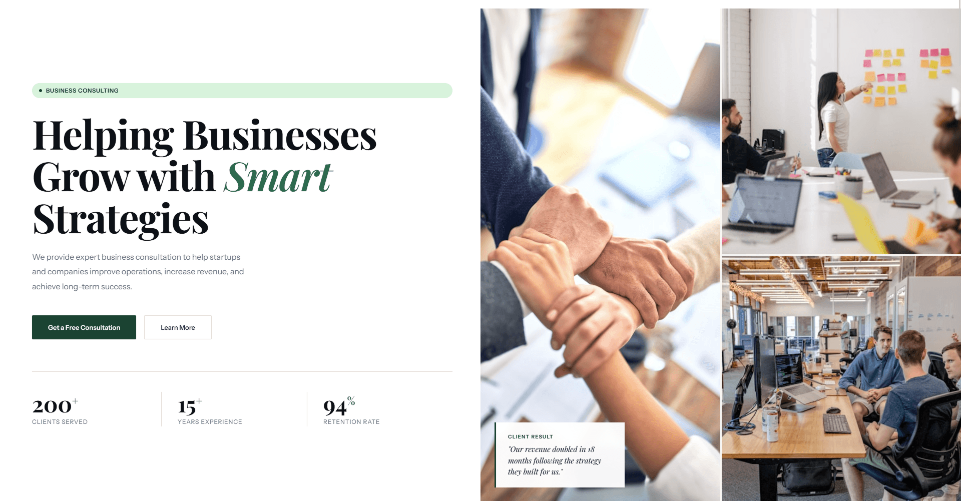
The homepage introduces the firm, explains its services and leads to the free consultation. About Us has more room for the company’s story, approach, expertise, mission and vision.
I also built the pages in HTML, CSS and JavaScript so someone could switch between them and scroll through the work in a browser.
homepage
about-page
Submission
I finished the required designs, the identity and the documentation within the project window. I included the HTML prototype alongside the static designs so the pages could be tried in a browser.
Planning
The deadline included everything, even the time spent naming the company and preparing the submission. I worked through research and identity first, then the pages and posts, and left the last part for documentation and review.
My part
The brief gave me the deliverables. I came up with Lucent, worked out the brand and page designs, made the social posts, and wrote most of the prototype code. It was a solo test, so I had to get the whole submission finished and check that it held together.
I used Figma for the pages, Photoshop and Illustrator for the posts, and VS Code for the prototype. AI helped me move through some of the code work faster; the design choices and the finished submission were my responsibility.
Development
Both pages live in the same document. JavaScript changes which one is active; CSS handles the layout, type, and motion.
It opens without a framework or build step. It is a frontend prototype, so there is no backend or consultation booking service behind the buttons.
architecture
BROWSER
├── FIXED NAV
├── #page-home (.page.active)
├── #page-about (.page)
└── VANILLA JS
    ├── goto(page) → swaps .active
    ├── goSec(id) → smooth scroll
    ├── IntersectionObserver → reveal states
    └── scroll listener → nav.scrolled
Development
The page-switching helper resets the scroll position when I move between Home and About. Section links scroll to the right place, and IntersectionObserver handles the reveal effects.
Around 1000px, the larger grids collapse and the navigation disappears. I did not add a replacement menu. That is a gap in the prototype’s phone layout.
Visual choices
I chose forest green and cream, with Playfair Display for headlines and Instrument Sans for the smaller text. Syne appears in labels and some display text.
The photographs show offices and people working together. I used rectangular containers and space between sections to separate the content.
palette
| Token | Hex | Role |
|---|---|---|
| Near Black | #1B2B19 | Primary dark / text |
| Forest Green | #1B4332 | Primary brand / CTA |
| Mid Green | #2D6A4F | Interactive / secondary accent |
| Light Green | #52B788 | Accent on dark |
| Cream | #F7F6F2 | Primary light surface |
| Muted Gray | #6B7280 | Secondary copy - requires contrast care on cream |
type
| Typeface | Role | Intent |
|---|---|---|
| Playfair Display | Headlines | Large serif statements |
| Instrument Sans | Body and interface | Readable supporting text |
| Syne | Labels and display accents | Geometric contrast |
A decision I added
The supplied content asked people to book a consultation but did not explain what came after. I added a Process section with Discovery, Analysis, Strategy and Execution so the steps were visible before making contact.
The services went into a grid. I also gave the company figures from the brief a prominent place on the page.
Review
I went back through the brief, compared the website with the posts, and checked the prototype’s layout and interactions. I did not run usability sessions or collect analytics, so I still need to see how people respond to the pages and consultation flow.
Looking back
I would keep the Process section. It answers something I wanted to know while reading the brief.
I would fix the missing mobile menu first, then watch people use the pages. I spent too much of this version working from the desktop layout.
AERL MRTN · FORGE · LUCENT
Tell me what you need to make and what you already have. Copy, references, or a rough idea are enough to start.
build@aerlmrtn.comAerl Martin Jimenez · Design and engineering.
Let’s see if I’m the right person.
You don’t need to know exactly what you need. Tell me where you are, and I’ll help determine where I fit.
Curious how this was made?
Open the Hood ↗